(Author’s Note: this post originally appeared on my old blog, Bakhtin’s Cigarettes.) I don’t want to jinx the man, but the fact that Kirk Douglas still lives is an unmitigated source of joy for me. If you believe, as I do, that movie stars become movie stars because of some internal life-force, whose aura is palpable even when projected onto a silver screen, then Kirk Douglas seems like the best proof of this theory.
At 101, Douglas is a living bridge to Hollywood’s second Golden Age—the 1940s to late 1950s. A bone fide movie start by 1949, Douglas was, along with other mavericks like Burt Lancaster, one of the first major actors to become a power-player in his own right. In an era when the Hollywood studio system traded actors like cattle, he formed his own studio and made his own films. He fostered young writers and directors—most notably, a brilliant, aloof young filmmaker named Stanley Kubrick.
Christmas came early for me this year! Many thanks to Ms. Oline Cogdill and the good folks at the Sun-Sentinel for putting Twice the Trouble on their Best Mystery Fiction Books of 2024 list! I am very honored.
One of the coolest classes I took at U.F. was Intro To Astronomy, taught by a funny old German guy named Heinrich Eichorn who, I later learned, was Chair of the Astronomy Department. (Yes, this was back in those quaint old days when top-notch professors had to actually, you know, teach class. And not just to grad students!) While Professor Eichorn’s lectures tended to meander a bit, he had a genuine enthusiasm for the subject that students, myself included, could sense and respond to. I remember one particular class when, in one of his usual, off-topic asides, he said, “We know the universe is not infinite. If it were, then every point in the sky above us would always be as bright as a star.”
For me, this was one of those mind-blowing moments when one is exposed to the wisdom of the ages. In this case, it was that of another German astronomer, Johannes Kepler, who in 1610 realized that if the universe really were infinitely large, and infinitely old, then every line-of-sight direction one looks at in the sky should eventually hit a star. Thus, the entire sky should be as bright as (and, worse still, as hot as) the surface of a star. Nevermind the fact that most of these stars would be very, very far away. Their light would still have an infinite amount of time to reach us, and there would be an infinite number of them shining down on us.
When I was a public school kid back in the 1980s, I used to spend hours at the bookstore, mostly looking at science fiction books. It wasn’t just the stories themselves that interested me, but the cover art. Back then, before the internet gave one an endless supply of great sci-fi concept art of any kind, the only way to get one’s imagination going was to head to the bookstore.
So, it’s probably inevitable that I would regard that time as a golden age of sci-fi cover art. And I do. When I look at sci-fi books today, there is usually no cover art to speak of, but just an exercise in graphic design. The title goes in this font 38 point; the author’s name goes in this font at 28 point; etc.; with some blurry, abstract notion of an alien planet or a futuristic city. Back in the pre-digital days, sci-fi cover art consisted mainly of actual paintings, made by actual painters.
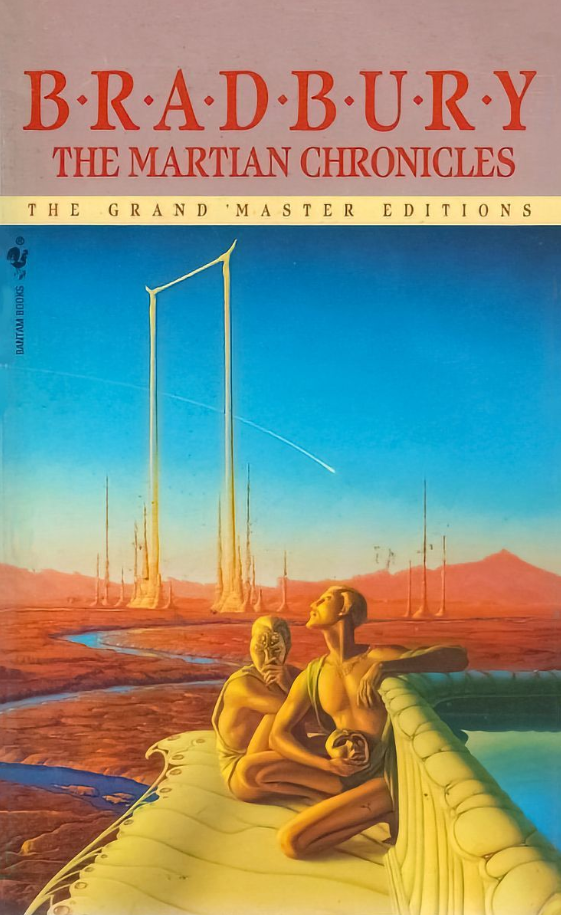
One of the best actual painters was (and is) Michael Whelan. His work has that perfect blend of realism, action, and whimsy that I always looked for in a good sci-fi cover. For five decades, he created some of the best covers ever made, and they earned him a place in the Science Fiction Hall of Fame.
One of my favorites is the one above, his cover for the 1990 Bantam/Spectra edition of Ray Bradbury’s The Martian Chronicles. If you haven’t read it (and you should), it’s an allegory about the loss of ancient wisdom, the horrors of capitalism, and even the conquest of the American West. Haunting the work are the ghosts of the Martians themselves, who once-great civilization is helpless in the face of the invading Earth-men, with their guns and disease and endless greed. I love this cover because it gives you a sense of that lost majesty, but it also makes you curious about the story.
The latest entry in my continuing series celebrating Nerds in the News (STEM nerds, mostly, as opposed to book nerds, of which I am one) goes to these two young, awesome math nerds. Back in 2022, using nothing but trigonometry (which, as it happens, was the only class I failed in high school), they came up with an entire new proof of the Pythagorean Theorem. Even more incredible, these two mathematicians were both teenagers at the time. And they still are!
I am, of course, terrible at math, but I am endlessly fascinated by it. One of my favorite non-fiction books of all time is Simon Singh’s excellent Fermat’s Enigma, which recounts master-mathematician Andrew Wiles’ quest to solve Fermat’s Last Theorem, which eluded math nerds for hundreds of years. (Wiles solved it in 1993.) Coincidentally, that problem also directly concerned the Pythagorean Theorem, and Singh recounts the story like a centuries-old mystery. One interesting point about the tale is that many advances in the hunt for the solution were made by amateur mathematicians, which is exactly what Ms. Johnson and Ms. Jackson are. (This is due to their youth; I have a feeling they will go on to have great careers after…you know, they graduate college).
Congratulations, Ms. Calcea Johnson and Ms. Ne’Kiya Jackson!
Anyone who is all interested in mystery fiction might avail themselves of this long (three chapters!) sample of the audiobook version of Twice the Trouble. It’s free on Youtube from Google Play. Check it out…!
Ursula K. Le Guin was one of our finest science fiction writers, and The Left Hand of Darkness is probably her best book. Not only did it anticipate by half-a-century the seismic cultural shifts that are currently roiling Western society regarding issues of gender-identity and sexual orientation, it’s also just a damned good sci-fi story.
Set in the far future, it takes place on Gethen, a wintery planet with a post-industrial civilization. Genly Ai is an Earth-man who is sent to Gethen on a diplomatic mission, hoping to convince the locals to join the Ekumen (basically, Le Guin’s version of the United Federation of Planets). Genly’s efforts are frustrated by long-standing, internecine conflicts between the Gethenians themselves, and also by his own difficulty in relating to the local people. People on Gethen are, it seems, are androgenous—serially androgenous, actually, existing as one sex for a part of the month and as females for the other. (As Le Guin beautifully describes, they subtly change their outer physiognomy, depending on which gender they are currently occupying, appearing to be “men” some of the time and “women” at others.)
Even now, it’s a pretty far-out concept, but it was totally mind-blowing in 1969 when the novel came out. Trust me, though—it’s a very exciting book. Genly soon finds himself caught between warring nations and is arrested as a potential spy. He is rescued by Estraven, the former prime minister of one of the countries, who helps Genly escape. They set off on a life-and-death adventure, sledding across the frozen wilderness of Gethen and trying to get to safety. In the process, Genly is forced to come to terms with his own deep-rooted conceptions of sexuality, while Estraven faces the prospect of Gethen being just one small planet in a vast, strange galaxy.
Le Guin is often described as a literary science fiction writer, and it’s true. Her prose and descriptive eye were top-notch, and she was able to weave Big Ideas (Feminism, Taoism, etc.) into her fiction without it feeling like a Humanities 101 lecture. The edition I read had this great cover by veteran illustrator Alex Ebel, which might seem a bit cheesy today but was striking and evocative at the time. I love the way it captures one of the major visual motifs of the novel, that of linked-opposites (light and dark, male and female, good and evil, progressive and reactionary). It’s a great, surreal representation of a great novel.
Of all the categories of genre fiction that I’ve consumed over my lifetime, fantasy has probably best the least represented. Sure, I love The Lord of the Rings, and The Narnia Chronicles, and the works of Ray Bradbury that I consider to be dark fantasy (see Something Wicked this Way Comes). But I don’t keep up with many modern fantasy writers nor read many contemporary fantasy novels.
So, you can imagine my surprise when I took a chance on Susanna Clarke’s Piranesi, a fantasy novel that made quite a splash when it came out in 2020, and I enjoyed the hell out of it. It’s a fascinating story of a man trapped in a labyrinth that he calls The House, and which is composed of endless Greco-Roman halls lined with innumerable statues and vestibules. There is a sky above and ocean tides below, which often flood the lower levels. The man is called Piranesi by the only other person (i.e., “the Other”) in The House, an older man who seems able to leave somehow, only to return with key supplies like vitamins and batteries, which he shares with Piranesi.
It’s a fascinating book, and unexpectedly suspenseful, too, especially when Piranesi begins having flashbacks of who he is and how he came to be in the House. This happens about the same time as the sudden appearance of mysterious, written messages that are scattered throughout the House. They seem to have been left by another, recent intruder (one who seems interested in helping Piranesi escape).
For me, at least half of the appeal of Piranesi lies in this whodunnit factor. Like the protagonist himself, I was caught up in the mystery of how he came to be there, who he is, and how he might get out. But the other half lay in the dizzying, intricate nature of the setting—the endless labyrinth that Piranesi inhabits. Such dreamlike settings are more common in literature than one might think, and their appeal is very much like that of a vivid, fabulously detailed diorama, of the sort that all children love to gaze into (and imagine themselves inside).
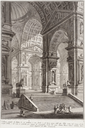
Capriccio Illustration by Giovanni Piranesi
I don’t know what it is, exactly, about mazes, labyrinths, and castles that evokes the power of imagination, But I think it has to do with their endless novelty, the promise of infinite rooms and corridors that we, like children, would love to explore. More to the point, such structures also symbolize the power of imagination—especially the child-like imagination that each of us still harbors. That’s why there is such a grand tradition of castles and mazes in fantasy literature and mythology, from the Minotaur’s labyrinth to the vast, rambling ruins of the Gormenghast trilogy.
Clarke herself acknowledges this tradition in her main character, Piranesi, who is named after Giovanni Battista Piranesi, the 18th Century illustrator who was famous for his drawings of impossibly grand and complicated imaginary buildings. His most famous works are a series of etchings titled Carceri d’invenzione (Imaginary Prisons), and these are, themselves, part of a much older tradition of so-called capricci, drawings that depict architectural fantasy.