Despite a youth in which I read literally hundreds of sci-fi novels, I somehow missed the works of Clifford D. Simak. I would blame the fact that Simak wrote his best books long before I was born, in the Golden Age of Science Fiction, but I managed to read other giants from that period like Isaac Asimov and Robert Heinlein. No, I think I missed Simak simply because, well, he wasn’t as popular as those guys. In fact, he became known as one of the founders of Pastoral Science Fiction, a sub-genre in which the stories are set in rural or other off-beat settings. (Sounds sexy, huh?)
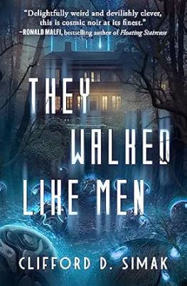
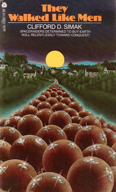
So, you can imagine my surprise when I read Simaks 1964 novel They Walked Like Men. I stumbled upon the book on my local library’s web site. It was a modern copy (see the excellent 1979 cover below by Jan Esteves), and I figured that if my librarians like it enough to buy an e-book copy, it must be worth a shot. So, I checked it out. And I loved it. It’s one of the strangest, edgiest sci-fi novels I read in a long time. Imagine an alien invasion narrative, set in the early 1960s, in which the major plot point is…real estate.
Sounds funky, right? The protagonist, Parker, is a hard-drinking, noirish newspaper man who stumbles upon a plot by mysterious strangers to buy all the real estate in town. Naturally, the strangers turn out to be aliens whose actual shape is something like a bowling ball, but who can simulate almost any form—kind of like the T-1000 in Terminator 2, with equally gruesome results. Parker makes it his mission to get to the bottom of the murderous aliens’ plan, whose true motive turns out to be even stranger than I suspected.
Honestly, I can’t believe no one has adapted this book into a movie. It reads like The Maltese Falcon meets Twin Peaks meets The Invasion of the Body Snatchers. I could someone like Jordan Peele coming in and making this into a really cool, eldritch thriller.
In the meantime, we have the book! Check it out…
Here is the cover from the latest printing, which I also really like…