If I were to make a list of the most influential science fiction novels of all time, William Gibson’s Neuromancer would surely be on it. How often does a book create a whole genre—almost single-handedly? I say “almost” because there were other cultural touchstones of the cyberpunk genre, primarily Ridley Scott’s landmark film Blade Runner. But Neuromancer was the primary literary component of the movement, with its landscape of towering, high-tech super-cities where the rich live high (in every sense of the word), and the poor live very, very low.
Expanding on his ground-breaking short story, “Johnny Mnemonic,” Gibson created a dark near-future in which giant “mega-corporations,” many of them Japanese, have taken control of all aspects of life, and the richest people have almost become a different species. Average people either work as wage-slaves to the corporations, and the closest thing to a counterculture is a teeming underclass of rebel hackers who make their existence by spying on (and stealing from) the corporate oligarchy.
These underground, anti-heroes are the punks of cyberpunk, and they are what made it so compelling as a genre. In a world where technology and corporate greed have dehumanized everyone, the punks beat the system at its own game. They do so by humanizing it, using their courage, individuality, and creativity to win in the one place where everyone is still equal—in the virtual world of cyberspace.
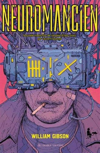
That’s why I like this cover so much. Strangely, though Neuromancer was published forty years ago, there has never been a cover that really captured the vibe and essence of the book. Until this one. It’s a very obscure cover belonging to a Brazilian edition of the novel and created by Spanish artist Josan Gonzalez. I like it because it feels like a 1980s comic strip—specifically, the work of French artist Moebius from the magazine Métal hurlant back in the 1980s (truly, the golden age of cyberpunk). The character portrayed is, presumably, that of Case, the hacker-hero of the novel. With a cigarette dangling from his mouth and a welter of wires rising from his VR goggles (from his “brain,” essentially), he personifies the spirit of cyberpunk: a rebellious unflappability combined with human creativity and technical skill.
When I was a public school kid back in the 1980s, I used to spend hours at the bookstore, mostly looking at science fiction books. It wasn’t just the stories themselves that interested me, but the cover art. Back then, before the internet gave one an endless supply of great sci-fi concept art of any kind, the only way to get one’s imagination going was to head to the bookstore.
So, it’s probably inevitable that I would regard that time as a golden age of sci-fi cover art. And I do. When I look at sci-fi books today, there is usually no cover art to speak of, but just an exercise in graphic design. The title goes in this font 38 point; the author’s name goes in this font at 28 point; etc.; with some blurry, abstract notion of an alien planet or a futuristic city. Back in the pre-digital days, sci-fi cover art consisted mainly of actual paintings, made by actual painters.
One of the best actual painters was (and is) Michael Whelan. His work has that perfect blend of realism, action, and whimsy that I always looked for in a good sci-fi cover. For five decades, he created some of the best covers ever made, and they earned him a place in the Science Fiction Hall of Fame.
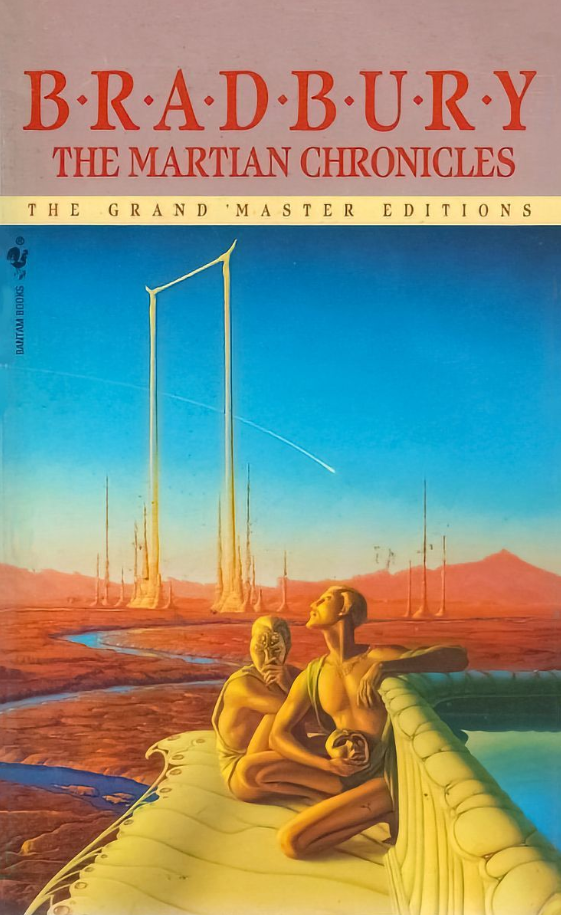
One of my favorites is the one above, his cover for the 1990 Bantam/Spectra edition of Ray Bradbury’s The Martian Chronicles. If you haven’t read it (and you should), it’s an allegory about the loss of ancient wisdom, the horrors of capitalism, and even the conquest of the American West. Haunting the work are the ghosts of the Martians themselves, who once-great civilization is helpless in the face of the invading Earth-men, with their guns and disease and endless greed. I love this cover because it gives you a sense of that lost majesty, but it also makes you curious about the story.
Ursula K. Le Guin was one of our finest science fiction writers, and The Left Hand of Darkness is probably her best book. Not only did it anticipate by half-a-century the seismic cultural shifts that are currently roiling Western society regarding issues of gender-identity and sexual orientation, it’s also just a damned good sci-fi story.
Set in the far future, it takes place on Gethen, a wintery planet with a post-industrial civilization. Genly Ai is an Earth-man who is sent to Gethen on a diplomatic mission, hoping to convince the locals to join the Ekumen (basically, Le Guin’s version of the United Federation of Planets). Genly’s efforts are frustrated by long-standing, internecine conflicts between the Gethenians themselves, and also by his own difficulty in relating to the local people. People on Gethen are, it seems, are androgenous—serially androgenous, actually, existing as one sex for a part of the month and as females for the other. (As Le Guin beautifully describes, they subtly change their outer physiognomy, depending on which gender they are currently occupying, appearing to be “men” some of the time and “women” at others.)
Even now, it’s a pretty far-out concept, but it was totally mind-blowing in 1969 when the novel came out. Trust me, though—it’s a very exciting book. Genly soon finds himself caught between warring nations and is arrested as a potential spy. He is rescued by Estraven, the former prime minister of one of the countries, who helps Genly escape. They set off on a life-and-death adventure, sledding across the frozen wilderness of Gethen and trying to get to safety. In the process, Genly is forced to come to terms with his own deep-rooted conceptions of sexuality, while Estraven faces the prospect of Gethen being just one small planet in a vast, strange galaxy.
Le Guin is often described as a literary science fiction writer, and it’s true. Her prose and descriptive eye were top-notch, and she was able to weave Big Ideas (Feminism, Taoism, etc.) into her fiction without it feeling like a Humanities 101 lecture. The edition I read had this great cover by veteran illustrator Alex Ebel, which might seem a bit cheesy today but was striking and evocative at the time. I love the way it captures one of the major visual motifs of the novel, that of linked-opposites (light and dark, male and female, good and evil, progressive and reactionary). It’s a great, surreal representation of a great novel.
Frank Herbert’s Dune is arguably the most successful science fiction book ever published, kicking off a series that (thanks to his son and other writers) continues to this day. Actually more a work of epic science fantasy than hard sci-fi, it was amazingly inventive and original, and it surely would have been a huge hit regardless of how it was packaged. However, I personally believe that its success was greatly increased by the brilliant marketing work done by Berkley Books in the 1970s. Specifically, their brilliant use of a font called Davison Art Nouveau that, with its swirly, vaguely Arabian vibe, perfectly captures the spirit of the books. The font was also used on all the sequels, creating a visual unity for Berkley’s Dune brand.
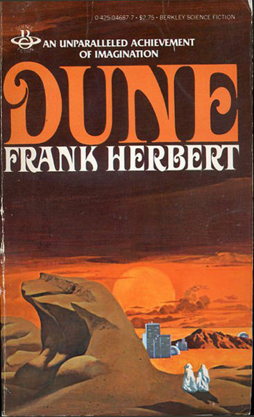
Even more striking, to me, was the sublime cover art by the legendary Vincent Di Fate. This is the edition of Dune that I read in high school, which means I’ve been looking at for four decades, and I never once suspected that it was done by Di Fate. Di Fate was, after all, a sci-fi artist primarily known for his space opera-style covers. He was already famous for these back in the 1970s, so much so that I my parents gave me a book of his cover art for Christmas one year. (Yeah, I was that nerd.) But his cover for Dune seems totally atypical for him.
Nonetheless, it’s a great cover. Putting a dune on the cover of Dune might seem like a no-brainer, but Di Fate’s choice here really gives the reader a sense of the book’s setting—the mysterious, pitiless desert planet of Arrakis. And if there was ever a novel where the setting becomes a character in and of itself, it’s Arrakis. The ghostly white figures depicted are obviously Fremen, the fierce native people of the story (never mind the fact that the Fremen in the book where black still-suits and not white robes). The fact that they seem to be crossing out of the desert and into the town is significant, too, because so much of novel involves the intersection of wilderness and civilization (the desert people being more “civilized,” in some ways, than those of the town).
When I was an English major at the University of Florida, one of the best classes I took was a Survey of Science Fiction Literature course. It covered a lot of famous American and British SF, some of which I had already read as a teenager and some of which were new to me.
Looking back on it now, it occurs to me that two of the writers we read in the class were not only totally different from each other, they also presented two completely opposite visions of what we now call artificial intelligence. These writers were Isaac Asimov and Harlan Ellison.
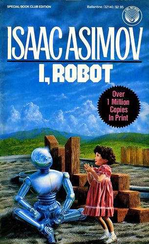
For Asimov, we read his early, seminal work, I, Robot. This is the short story collection that included his first formulation of the Three Laws of Robotics, which have been alluded to (i.e, ripped off) in countless other science fiction stories, including Star Trek. The book came out before the term AI became common parlance. Yet, in Asimov’s imagined future, the world is rife with robots that are essentially AIs with mechanical bodies. All of them have positronic brains (yeah, Star Trek ripped off this conceit, too) with the Three Laws hard-wired in. The result is that all robots function as humanity’s tireless, benevolent servants. (Some would say, slaves.)
Actually, they are much more than that. They can think, reason, and make choices. In fact, they have to make choices. The moral dilemmas created by the Three Laws as the robots interact with chaotic (and often evil) human beings is the source of drama in most of the stories.
Despite the mystery and drama of the stories, though, Asimov’s vision is a very optimistic, almost Buck-Rogers-esque idea of the future—not quite a utopia but close to it. There is no poverty, no hunger, no war. It’s only upon close reading of the stories in I, Robot that the exact nature of the master/servant relationship between humans and robots appears fraught—probably more so than Asimov consciously intended. This is especially true in a few of the stories, where it’s revealed that future governments are secretly run by the highest order of HAL 9000 style robots, whose plans might be beyond human comprehension.
Later in the Science Fiction class, we read Harlan Ellison’s short story “I Have No Mouth and I Must Scream,” which is quite possibly the darkest and most disturbing short story I have ever read, sci-fi or otherwise. And, of course, it involves an AI.
The story is mostly set underground, about one hundred years after a nuclear war wiped out all of humanity except for five people. The war was started by a mutinous Pentagon computer (yeah, just like Skynet) called AM that becomes self-aware and decides it hates human beings more than anything. After killing everyone on the planet, it preserves the five people as its playthings, running them through an endless number of elaborate, sadistic games. Unfortunately for them, AM has somehow obtained God-like technological power over physics, able to shape and project matter wherever it wishes, and also to keep the humans alive and immortal in their banged-up, miserable state. So, in effect, the protagonists spend an eternity in a kind of Holodeck-like hellscape, trying to figure out how to either escape or kill themselves.
Yeah, it’s heavy.
This enormous gulf between Asimov’s and Ellison’s visions of the future—an AI paradise versus an almost literal AI hell—is, in part, symptomatic of various generational and cultural shifts between the two men. I, Robot was published in 1950, on the tail-end of the Golden Age of Science Fiction, the time when the prosperity of America in the post-war years seemed destined to go on forever, fueled by newer and greater technological innovations (AI among them). In contrast, Ellison’s short story was published in 1967, at the height of a counter-cultural revolution that extended into science fiction literature —the New Wave that introduced some of my favorite sci-fi writers of all time, such as Samuel R. Delany, Ursula K. Le Guin, Roger Zelazny, and Ellison himself.
Thus, the difference between Asimov and Ellison’s work is essentially the difference between the lingering triumph of World War II and the horrors of VietNam. Between the optimism of the Atomic Age and the nihilism of the Cold War. In some ways, it’s also the difference between fantasy and realism, and between genre fiction and literary fiction. As dark as Ellison’s short story is, it’s also a much better work of fiction than Asimov’s. More convincing, too, alas. Told from the point-of-view of AM’s youngest victim, Ted, the story is filled with vivid, sharp writing and devastating passages, like this one:
Nimdok (which was the name the machine had forced him to use, because AM amused itself with strange sounds) was hallucinating that there were canned goods in the ice caverns. Gorrister and I were very dubious. “It’s another shuck,” I told them. “Like the goddam frozen elephant AM sold us. Benny almost went out of his mind over that one. We’ll hike all that way and it’ll be putrified or some damn thing. I say forget it. Stay here, it’ll have to come up with something pretty soon or we’ll die.”
Benny shrugged. Three days it had been since we’d last eaten. Worms. Thick, ropey.
You don’t have to be a literary critic to see that Asimov and Ellison are worlds apart, not just on the subject of Artificial Intelligence but on literally everything. Asimov was a scientist, a rationalist, and his optimistic views on the future of humanity were deeply rooted in the legacy of the Enlightenment. Ellison is more of a Gothic Romantic, full of existential angst and cosmic horror. His story is essentially an updated version of Mary Shelley’s Frankenstein, with the supercomputer in the role of the monster, determined to torment its creator.
Of course, the Frankenstein story is, itself, a reworking of an even older one—the Faustian myth. According to German legend, Faust is an intellectual who sells his soul to the devil in exchange for knowledge, and ends up going to hell. If the story seems familiar, it’s probably because the legend has been the psychological basis for countless tales of perverted science for centuries. Scientists, the story goes, want to attain the power of God, and thus end up being destroyed by their own hubris (often in the form of some infernal creation like Frankenstein’s monster or, more recently, SkyNet).
Isaac Asimov
Perhaps the biggest irony here (at least for me, personally) is that while I have great admiration for Ellison’s story, and I believe it is a much greater artistic work that anything ever penned by Asimov, Asimov’s vision is probably more accurate of what we can actually expect from the AI revolution. For all the hype about AIs destroying art and music and literature and taking away our jobs, I think AI will be a net positive for humanity. Perhaps a big net positive. It’s already making contributions in the fields of materials science, medicine, and even fusion energy. Yeah, it’s probably going to take away some people’s jobs, but those were probably crap jobs anyway. (If you train an AI to do it as well as a human, it’s probably not worth doing.)
As for the whole AM/Skynet thing, I don’t worry about it because I don’t believe computers will ever become conscious. In fact, the very idea of a machine becoming conscious seems like a category error, the kind of conceit that will seem laughable a hundred years from now as those old drawings of “men of the future” with feathered wings strapped to their arms.
Harlan Ellison
This doesn’t mean, of course, that we won’t, someday, create an artificial life form that might replace us. But it won’t be a computer. It will be…something else.
It’s hard to believe that 32 years have passed since Neal Stephenson’s Snow Crash was published. Not only is it one of the best books of the 1990s, it’s also one of the definitive novels of the cyberpunk genre. In retrospect, one of the most surprising things about Snow Crash is that it’s not really a dystopian novel. It’s more like a satire, a spoof of corporate America’s relentless pursuit of wealth and power in the 21st Century. Its hero (deftly named Hiro) is a Ninja-level hacker by night and a pizza-delivery guy by day. The pizza company he works for is run by the mafia (which has become legal), and if he fails to deliver a pizza in thirty minutes or less, Hiro faces summary execution.
Yeah, it’s that kind of book. It also has some really kick-ass fight scenes.
I love this cover by Bruce Jensen because it’s photorealistic and immediately suggests a narrative, which is perfect for this kind of sci-fi, quasi-adventure novel. More importantly, it captures the crazy melange of elements that Stephenson squeezes into the novel. you’ve got a hero with his samurai sword walking towards a clearly futuristic, cyberpunk city. Paradoxically, he’s passing through an ancient stone doorway that might be a relic from Bronze Age Persia.
It’s an enigmatic cover but also thrilling and stimulating to the imagination. Which is exactly what one expects from a great sci-fi book cover.
When I was in high school back in the early 1980s, Arthur C. Clarke had already been a legend for decades. He was, in fact, one of science fiction’s “Big Three” writers, along with Isaac Asimov and Robert Heinlein. And so, the reprints that Del Rey books released of Clarke’s catalogue were especially clever in their cover art. Created by commercial artist Stanislaw Fernandes, they were minimalist, glossy, and retro (even then). In fact, they were almost art deco in style, somehow managing to suggest the “classic” quality that Clarke’s work had attained. After all, if people already know the author’s name, you don’t really have to “sell” the story itself.
My favorite cover from this line was for Clarke’s best novel, Childhood’s End. I love how it only details two objects: the U.N. building in New York, and the giant flying saucer hovering over it. (This isn’t a spoiler, really, since it happens in the first chapter.)
It’s a very simple cover, yet somehow evocative and beautiful. I especially like the little trident (or is that a pitchfork?) that sits atop the saucer. (I would reveal the significance of this in the story, but that would be a spoiler.)
Most of the art I’ve included in my on-going Classic Sci-Fi Book Covers series has been from the 1970s and 1980s. Two golden ages of sci-fi, surely, which, more importantly, marked my golden age of sci-fi—my middle- and high-school years when I devoured all kinds of science fiction novels from the previous decades.
And so it is with some surprise that I submit this episode’s sci-fi cover, which is only from 1998. But it’s still a classic. An instant classic, actually, and not just because it was done for one of the most influential sci-fi novels of all time, Philip K. Dick’s Do Androids Dream of Electric Sheep? Calling PKD a science fiction writer makes a bit more sense that calling Kurt Vonnegut a science fiction writer, or Franz Kafka a science fiction writer, but not much. Like Vonnegut and Kafka, Dick wrote surreal, even psychedelic novels that deal with issues of compassion, violence, identity, sanity. Most of all, they describe the problem of discerning reality from the fake. (The “ersatz,” as Dick likes to call it in his typical Germanophilic style).
Do Androids Believe in Electric Sheep is Dick’s most famous book, in part because it inspired Blade Runner but also because it’s just a fine, complex, and vivid novel. Rick Deckert, the protagonist, is a bounty hunter who finds and kills runaway androids (called replicants in the film, these are flesh-based artificial people who look and act like human beings, only crueler.)
The book was published in 1968 and has gone through dozens of editions and covers. But this cover, created by commercial artist Bruce Jensen, is my favorite. It depicts a male figure who might be a Greek statue, or a wax dummy (or an android), and yet whose expression conveys a sense of pathos that the viewer can’t quite look away from. This sense of pathos is amplified by the fact that lying between the viewer and the figure is a grid of what seems to be hog-wire, evoking a plot point in the book. Deckert, like many people in his dystopian future, keeps a farm animal as a pet—in his case, a sheep. But the wire also has echoes of the Holocaust, which is especially interesting since Dick’s inspiration for the book came after reading the diary of an S.S. Officer guarding a concentration camp. The figure is, we sense, a prisoner, although we don’t know what of. (Spoiler: it’s modern civilization.)
And then there is the sheep itself, rendered in a hallucinogenic little box over the male figure’s left eye. The only point of color in the work, the sheep draws the viewer’s attention the same way Deckert’s sheep draws out his latent humanity—it represents nature, vitality, warmth. Most importantly, it serves as something to love.
Love, as it turns out, is the last human quality that the androids learn (and most never do). It is also, Dick strongly suggests, the defining aspect of living things.
One of the first books I ever checked out by myself from the library was Ray Bradbury’s The Illustrated Man. I was a tween-aged sci-fi nerd at the time (as opposed to a middle-aged sci-fi nerd now), and this book started my life-long love affair with Bradbury’s fiction. More magical realism than actual sci-fi, his work always evokes a sense of the wonder I first felt when reading great science fiction.
Like Bradbury’s other masterpiece, The Martian Chronicles, this book is actually a “fix-up”—a collection of previously published short stories that are grouped together by a framing device. In this case, the “frame” is an unnamed drifter and former carnival worker who has tattoos all over his body (except for one crucial, bare spot on his upper back; you’ll have to read it to find out why). If you stare at any of the tattoos long enough, it comes to life and shows you a story—which leads directly into the short story in question.
It’s a very clever idea, and hauntingly rendered. Some of the more famous stories in the collection are “The Veldt,” “Zero Hour,” and (my favorite) “The Long Rain.”
The cover for the book’s first edition, by artist Dean Ellis, is still the best, and is also the one on the edition I checked out from the library, lo those many years ago. A work of trippy surrealism, the man in the painting does not look like the character in the book (who is flabby and middle-aged and has hair) but it captures brilliantly the sense of intellectual lyricism and magic, of which Bradbury was a master.
I started binge-reading science fiction when I was in 8th grade. That was the year that the local school board rezoned the kids from my White, suburban neighborhood to attend the largely Black, urban middle school, Lincoln, across town. This was a miraculous development for me because I had already attended Lincoln (back when my parents and I still lived in the ‘hood, or thereabouts), and I already loved it. But there was a downside—I had a really, really long ride on the school bus. Like almost an hour each way.
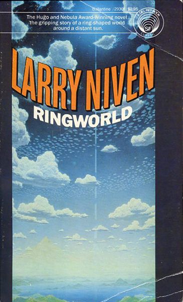
So, I started reading seriously, and as with a lot of boys at that age, my go-to genre was sci-fi. I read a lot of Arthur C. Clarke and Ray Bradbury and John Christopher. But perhaps the most revelatory, amazing book I had read up to that time was Larry Niven’s Ringworld. Never had a novel held such wonder for me, such a Tolkienesque landscape of adventure and possibility. The fact that Niven was able to pull this off in a book which is, even today, a prime example of so-called “Hard SF,” in which every story element must be grounded in, or acknowledge the effect of, some scientific principle.
The fact that Niven’s novel (the first of a tetralogy) has never been adapted to film is perhaps testament to this fact, the book’s off-the-chart nerd factor. Set in the 29th century, the story concerns an Earth-man, Louis Wu, who goes on adventure with two aliens and a human woman to visit a distant, recently discovered artifact called the Ringworld. It’s basically a giant, taurus-shaped space colony, so big that it wraps completely around its sun-like star. The entire ring spins to simulate 1G of gravity, and thousand-kilometer high mountains along the rim keep the air from leaking out. An inner ring of smaller, checker-box squares creates a shadow pattern on the inside of the big ring, creating a day/night cycle.
And there you have it, a plausible sci-fi world with normal gravity and a recognizable biosphere, including oceans, forests, deserts, mountains, and so on, but with an unbroken surface area equivalent to three million earths.
Oh, how this idea fired my thirteen-year-old imagination. Forget Shangri-La or Cathay or Edgar Rice Burroughs’s Mars or Middle Earth or any of the other fantasy lands of pre-1970s literature. Here was an endless realm that you could explore for a million years and never reach the end of. And, sure enough, as Louis and his alien comrades (one is a humanoid, Tiger-like creature called a Kzin, the other a two-headed cowardly alien called a Puppeteer) wander across the Ringworld, they encounter many of the tropes of 19th century adventure lit, including castles, galleons, savage tribes (including sexy native girls), shamans, sword-wielding heroes, etc. Niven accomplishes all this by establishing that the once high-tech inhabitants of the Ringworld have long since fallen into a pre-industrial state, leaving open the mystery of how this apocalypse happened and what remnants of the original civilization might remain, if any.
It’s a great, great adventure book, and it has inspired a number of fine covers. My favorite is the one above by Don Davis. Davis was in some ways an inspired choice since he was best known as a “space artist,” doing representations of proposed space colonies for NASA. (And, as I said above, the Ringworld is basically a giant space colony.) Davis’s cover captures the sense of wonder and endless possibility that novel creates, depicting a typical (summer-like) day on the Ringworld. In the distance, you can see the arc of the ring itself (the primitive inhabitants think it is an “arch”), complete with light-and-dark sections from the shadow squares.
It’s a fine cover, and I have no doubt that it and the book itself probably inspired the current obsession on the part of certain high-tech billionaires with the idea of space colonies, a possibility for a kind of endless utopia in outer space. And why not? Deep down, we’re all still thirteen-year-olds. Right?