My Latest Obsession: Vaporwave

I have a confession to make: I dream about shopping malls. Specifically, one shopping mall, the Oaks Mall here in Gainesville.

The “Collapsed Time” Effect of Vaporwave

After my parents’ divorce, I saw my mother mostly on the weekends, and one of our routine activities was to go to the mall. We would have lunch, see a movie, and wander around. Later, when I got into my teens, I spent a lot more time at the mall with my friends. We hit all the usual spots—the arcade, both bookstores (Waldenbooks and B. Dalton’s), the record store, Spencer’s Gifts, the toy store. And we did anything else we felt like. 
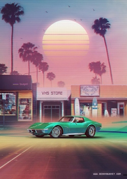
Trappings of the 1980s, along with “Broken Sun” motif

We weren’t alone, of course. After the collapse of downtown America, the mall was the last remaining public square. In suburban America, particularly, it was also the only fun thing to do on a Saturday afternoon. Or a Saturday night, for that matter. When I entered high school and started going on dates, we often went to a movie at the mall. One of my most vivid memories is of how strange and eerie the mall felt after the movie let out at 11:00 or so, and we would walk through the empty, dark hall with all the shops closed and metal gates drawn down. It was one of my first experiences of liminal space, and it sticks with me even today.

In fact, it haunts my dreams. Literally. For when I dream of the Oaks Mall now, I often find myself lost among its corridors near closing time, the wings still busy with shoppers but with the crowd starting to thin out, little by little. Stranger still, my dream-mall is huge—the size of Manhattan Island, practically. A gigantic labyrinth of brand-name stores, all of which are in the early stages of shutting down for the night. (My subconscious, I think, is warning me that the mall is shutting down forever.) These dreams often end in a sense of panic as I realize I am on the wrong side of the mall from my friends, or my car, or whatever, and I will never be able to reach them/it in time before…what? Closing? It’s not clear, but whatever it is, it’s kind of scary.

Despite the disquieting nature of these dreams—or perhaps because of it—I find myself endlessly fascinated by what has come to be known as the Vaporwave aesthetic. Vaporwave is primarily a visual genre, marked by artistic images of 1980s culture. That is, computer graphics, shopping malls, the Miami skyline (ala Miami Vice), fast food restaurants, music videos, video stores, and old-style video games.

And neon. Lots and lots of neon.

Empty Mall / Liminal Space Vibe Typical of Vaporwave

The overriding effect is that of a hyper-real fantasy that feels like a time-portal back to the 1980s. I love these images because they somehow evoke the memory of that long ago time, at least for me. More accurately, they evoke the feeling I wanted to have at the time but could never quite capture. The feeling of an endless, prosperous, fun, high-tech future.

I think that this is the real power of nostalgia. A wise man once defined nostalgia as a fondness for a Time that never existed. I don’t think that’s quite right. Nostalgia is a fondness not for a lost time but for a lost hope—the hope one felt and in a familiar place and a long-ago time. A hope that, though never realized, still lingers in the heart. 

That sense of lost opportunity is, I think, reflected in the very name of the genre itself, vaporwave, which is very similar to vaporware, a term coined in the 1980s to mean great-looking software that was promised by advertisers and corporations but which never actually materialized. It simply evaporated.

The same thing happened to our collective dreams back in the 1980s. My friends and I all hoped that we could look forward to a glorious future, one better than that of our parents’ and teachers’ generation. A future that would be made bright by the many technological revolutions (the digital revolution, especially) that were impacting every aspect of our culture: movies, TV, music, art, games, fashion, and even books. The haunting images of vaporwave reflect that lost dream—rather than the sterile reality—of the 1980s and ’90s.

Many vaporwave images seem to have a psychedelic “collapsed time” feel to them, as did many of the music videos and computer-generated short films of that era. The hippie generation had the psychedelic flower as their symbol. We had the computer-generated sun—the so-called “broken sun”—which seems to have been pulled directly from of a film poster or a television commercial from 1982. 

As attracted as I am to vaporwave, I am equally drawn to its parallel music genre, synthwave. Like vaporwave, synthwave is characterized by the early computer-era vibe, as symbolized in synthesized music. Not actual synthesized music from the 1980s, of course, but rather music that sounds a lot like it, yet is somehow drained of all melodrama and false tension that characterized synth-music back then. Synthwave has a kind of purity to it. A simple beauty that surpasses the actual music of that time.

In other words, synthwave is to actual 1980s music what Andy Warhol was to actual advertisements of the 1950s. His silk screen images of Campbell’s soup cans looked almost exactly like actual soup cans, but larger, stylized, more vivid. They made the world really see Campbell’s soup cans—the sublime nature of everything, even a mass-produced soup can—for the first time. Warhol’s genius lay in his ability to show us the beauty and promise of something that was once central and even commonplace in our lives, even as it mocked (lovingly) that very same thing.

That’s what vaporwave does, too. Through the alchemy of art, it somehow humanizes the relentless, corporate-controlled media barrage of the 1980s. For me, and millions of others like me, it is literally the stuff that dreams are made of.

Or were made of, that is. Back in the day.

Lo-Poly, Computer-Generated Background with Broken Sun
Blatent Consumerism of the 1980s, both celebrated and mocked

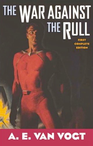
Classic Sci-Fi Book Cover: “The War Against the Rull”

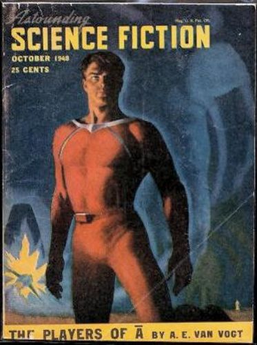
This entry in my on-going Classic Sci-Fi Book Covers series is both old and new. That is, it’s a modern touch-up of the cover from the October 1949 edition of Astounding Science Fiction painted by Hubert Rogers. That issue included a work by A.E. van Vogt, but not the one we are interested in here. This modern version is from a 1999 edition of van Vogt’s classic sci-fi novel, The War Against the Rull, which I distinctly remember devouring in two days when I was in eighth-grade.

I like this cover a lot. It’s not just a classic. It’s an archetype. Specifically, the archetype of the heroic (America) scientist, a buff intellectual and polymath whose ilk could be found in countless works of Isaac Asimov, Robert Heinlein, Roger Zelazny, and on an on. In The War Against the Rull, the man is Dr. Trevor Jamieson, a brilliant scientist who is also a fierce warrior and survival-expert. He’s stranded on an alien planet with a huge, six-legged, intelligent creature called an ezwal who wants to kill him. But when both Jamieson and the ezwal encounter a mutual enemy—a race of aggressive, centipede-like aliens called the Rull—they decide to work together to survive.

It’s a great story, like so many from the sci-fi’s Golden Age. I’ve written before about why sci-fi novels from that era are so much more enjoyable (to me, at least) than most of those written in the last ten years or so. I think it has to do with the gritty humanity of such stories. Yeah, Jamieson is essentially a comic-book character (think Doctor Quest and Race Bannon rolled into one), but van Vogt does a great job of making you believe he’s in real trouble. The ezwal, too—he’s a compelling character in his own right. You get involved in the desperate nature of their situation, and you keep reading to see how they will get out of it.

Anyway, check it out if you can…

Original Cover from Astounding
Cover from the 1970 edition that I read as a kid (by artist John Schoenherr)
Another version of the Scientist Hero Archetype (by artist James Bama)

What I’m Reading: “Rod: The Autobiography”

Rod_ TheAutobiography2

One of the many things I learned from Rod Stewart’s memoir, Rod: The Autobiography, is that the technical process of recording a studio album is very strange.  For instance, the lead singer usually records his vocal track in a soundproofed room, by himself, wearing headphones so that he can listen to the band’s instrumental track.

It seems a very sterile and artificial process–not at all what one pictures when imagining a rock singer at work.  And so I was impressed to learn that Stewart has always rejected this technique, insisting on recording all tracks directly with his band:

When we were recording, I liked to be in the sound room with the band, walking around with a microphone  in hand, so that I could look them in the eye, interact with them, perform with them, basically.  I think it slightly startled the engineer, who was more used to having the singer isolated behind screens, or in an entirely separate vocal booth.  I remember hearing how Frank Sinatra had once been parked by an engineer behind a screen in a recording studio and he had made them take it down.  In order to sing, he needed to feel the sound of the orchestra hit him in the chest.  I guess this was my own version of that.

It’s interesting that Stewart draws a comparison between himself and Sinatra.  As I learned from James Kaplan’s fine bio of Sinatra, the great crooner himself exerted tremendous effort when preparing for one his recordings.  He was known to read the song lyrics aloud to himself, almost like prose.  He felt he had to discover the emotional truth of the lyric before he could sing it, and if that truth was not forthcoming, he would nix the song.

Continue reading “What I’m Reading: “Rod: The Autobiography””

Classic Sci-Fi Book Cover: “Lord of Light”

I’ve read a lot of trippy science books in my time, but Roger Zelazny’s Lord of Light is probably the trippiest. The only one that sort of comes close is Frank Herbert’s Dune, which makes a lot of sense considering both were written in the 1960s by two extremely smart and talented writers. (One of Zelazny’s other books, This Immortal, actually shared the Hugo Award with Dune in 1967.)

In fact, there’s not really a name for what Lord of Light is. Technically, it’s science fiction fantasy (a sub-genre I’ve written about before). That is, it looks and feels like a fantasy novel (as does Dune) until you realize that the plot has a sci-fi underpinning. Lord of Light is set on an alien world in which the population is stuck in a pre-industrial state, ruled over by gods of the Hindu pantheon. These gods interact with mortal humans on a daily basis, using magical powers and objects to control their destiny. Throughout the novel, however, Zelazny drops carefully crafted clues that the “gods” are actually the crew of a starship called The Star of India, which crash-landed on the planet centuries before.

These faux-deities use high-technology to set themselves up as gods, complete with a kind of immortality (they can transfer their consciousness to new, young bodies when the old ones wear out). They rule over the common people (who are revealed to be the descendants of the passengers of the ship) with an iron fist, doling out justice and retrobution from a floating, anti-gravity city (“heaven”). This reign is, ostensibly, for the people’s own good (tyrants always say this, right?). But when one of the last democratically-minded crew members, Sam, takes on the role of Siddhartha, he poses a threat to the status quo, which has kept humanity stagnant for generations.

This 1987 edition from Avon was the one I read in college, and I still own it. Its cover was done by an English illustrator named Tim White. I really like it because it captures that essential trippiness. At first, it looks like a pop-religion book, depicting figures dressed like Hindu gods. But what’s with the blue electric bolts? Or the floating city? And why is one of the Hindu “goddesses” blonde?

Ahhh, it’s really a sci-fi novel.

Yes, it is.

Books on Art: “de Kooning – An American Master”

deKooning

On those rare occasions when I choose to read a big, fat, thick-as-a-brick book about a famous person, I usually pick one about a politician. David McCullough’s Truman is a great example. I tend to gravitate toward books about political figures because, in the course of reading about their lives, you also get a free history lesson. That is, the story of Harry Truman is also the story of World War II, the atomic bomb, Korea, the founding of Israel, and the Berlin Wall.

Biographies of artists are more problematic, for me.  I just finished reading de Kooning: An American Master, by Mark Stevens and Annalyn Swan. It chronicles the long life of the great painter—a life barely contained within the span of the Twentieth Century—in which de Kooning lived to be the celebrated, Grand Old Man of modern American art. He became, in fact, the only American artist whose figure and reputation approached those of Picasso.

Continue reading “Books on Art: “de Kooning – An American Master””

R.I.P. David Lynch

Photo by Alan Light, CC BY 2.0

It has been a week since David Lynch passed away, and many great tributes have already been written about him. I’m tempted to say that I needed a week to process his passing and figure out what I wanted to say about him, but the truth is I was just too damned busy to write anything. In fact, I knew instantly what I wanted to say—simply, that Lynch was a very important person in my life, and in the lives of many of my friends.

I was a college English major in 1986 when Blue Velvet came out, and it hit me and my circle of arty friends like an atomic blast. I already knew of Lynch’s work (I was one of the few kids to see The Elephant Man, and in an actual movie theater, no less), and I knew that he was a director of enormous visual and thematic power. But even I was unprepared for Blue Velvet. On the one hand, it’s a murder mystery, an homage to the noir films of the 1950s in which an unsuspecting suburban kid discovers a hidden world of violence, evil, and, (of course) depraved sexuality. On the other hand, it’s a surrealist vision of the inner world of a modern young man (and, probably, many young women). I was roughly the same age as the main character, Jeffrey Beaumont, in 1986, and so the film had special resonance. I felt like the landscape of my own imagination was a strange blend of the beautiful and the grotesque—often in the same image. And that’s exactly what the film captures, somehow.

Continue reading “R.I.P. David Lynch”

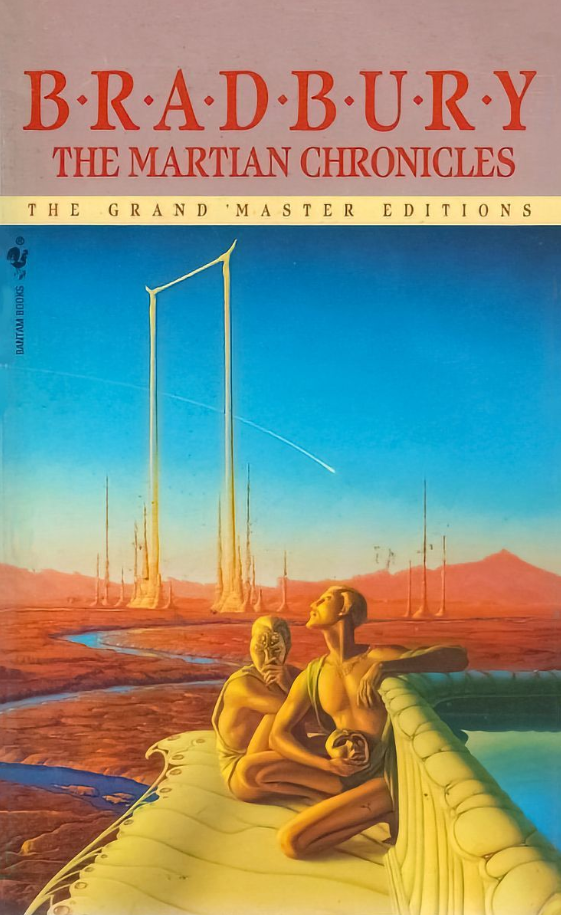
Classic Sci-Fi Book Cover: “The Martian Chronicles” – Michael Whelan

When I was a public school kid back in the 1980s, I used to spend hours at the bookstore, mostly looking at science fiction books. It wasn’t just the stories themselves that interested me, but the cover art. Back then, before the internet gave one an endless supply of great sci-fi concept art of any kind, the only way to get one’s imagination going was to head to the bookstore.

So, it’s probably inevitable that I would regard that time as a golden age of sci-fi cover art. And I do. When I look at sci-fi books today, there is usually no cover art to speak of, but just an exercise in graphic design. The title goes in this font 38 point; the author’s name goes in this font at 28 point; etc.; with some blurry, abstract notion of an alien planet or a futuristic city. Back in the pre-digital days, sci-fi cover art consisted mainly of actual paintings, made by actual painters.

One of the best actual painters was (and is) Michael Whelan. His work has that perfect blend of realism, action, and whimsy that I always looked for in a good sci-fi cover. For five decades, he created some of the best covers ever made, and they earned him a place in the Science Fiction Hall of Fame.

One of my favorites is the one above, his cover for the 1990 Bantam/Spectra edition of Ray Bradbury’s The Martian Chronicles. If you haven’t read it (and you should), it’s an allegory about the loss of ancient wisdom, the horrors of capitalism, and even the conquest of the American West. Haunting the work are the ghosts of the Martians themselves, who once-great civilization is helpless in the face of the invading Earth-men, with their guns and disease and endless greed. I love this cover because it gives you a sense of that lost majesty, but it also makes you curious about the story.

In other words, it kindles the imagination.

R.I.P. James Earl Jones

Let’s face it, 99% of the people alive today who knew anything at all about James Earl Jones knew about him from Star Wars. He was, after all, the voice of Darth Vader, the most commanding villain in all cinema.

My first memory of Jones, however, was from the early 1970s, when I was a little kid. I was watching a made-for-TV movie about the Barney and Betty Hill UFO incident. Jones played Barney, and the scene where he recalls, under hipnosis, his encounter with a UFO struck me, even a kid, as unbelievably powerful and even scary. (If you can find this movie on Youtube, you should check it out.)

It’s important for us all to remember how truly great an actor Jones was. He wasn’t just a voice–he was a master of the entire art. One of my lit. professors in college recalled seeing Jones as Othello on Broadway in a now-legendary production with Christopher Plummer as Iago, and how absolutely mesmerizing Jones was.

In keeping with that memory, I am posting a brief, command performance that Jones did of a scene from Othello about ten years ago.

Godspeed, Mr. Jones….!!!

Classic Sci-Fi Book Cover: “The Left Hand of Darkness”

Ursula K. Le Guin was one of our finest science fiction writers, and The Left Hand of Darkness is probably her best book. Not only did it anticipate by half-a-century the seismic cultural shifts that are currently roiling Western society regarding issues of gender-identity and sexual orientation, it’s also just a damned good sci-fi story.

Set in the far future, it takes place on Gethen, a wintery planet with a post-industrial civilization. Genly Ai is an Earth-man who is sent to Gethen on a diplomatic mission, hoping to convince the locals to join the Ekumen (basically, Le Guin’s version of the United Federation of Planets). Genly’s efforts are frustrated by long-standing, internecine conflicts between the Gethenians themselves, and also by his own difficulty in relating to the local people. People on Gethen are, it seems, are androgenous—serially androgenous, actually, existing as one sex for a part of the month and as females for the other. (As Le Guin beautifully describes, they subtly change their outer physiognomy, depending on which gender they are currently occupying, appearing to be “men” some of the time and “women” at others.)

Even now, it’s a pretty far-out concept, but it was totally mind-blowing in 1969 when the novel came out. Trust me, though—it’s a very exciting book. Genly soon finds himself caught between warring nations and is arrested as a potential spy. He is rescued by Estraven, the former prime minister of one of the countries, who helps Genly escape. They set off on a life-and-death adventure, sledding across the frozen wilderness of Gethen and trying to get to safety. In the process, Genly is forced to come to terms with his own deep-rooted conceptions of sexuality, while Estraven faces the prospect of Gethen being just one small planet in a vast, strange galaxy.

Le Guin is often described as a literary science fiction writer, and it’s true. Her prose and descriptive eye were top-notch, and she was able to weave Big Ideas (Feminism, Taoism, etc.) into her fiction without it feeling like a Humanities 101 lecture. The edition I read had this great cover by veteran illustrator Alex Ebel, which might seem a bit cheesy today but was striking and evocative at the time. I love the way it captures one of the major visual motifs of the novel, that of linked-opposites (light and dark, male and female, good and evil, progressive and reactionary). It’s a great, surreal representation of a great novel.

Brief Encounters with Infinity

Autumn Rhythm (Number 30)
Jackson Pollock, Autumn Rhythm (Number 30)

Back in the dot.com boom of the 1990s, I was lucky enough to work for an IT company based in New York City. I was a remote worker, writing software eight hours a day in my spare bedroom in Gainesville, Florida. It was a win-win situation. I got to work from home, and my bosses got a good developer for country-boy wages (and I was still in the same time zone).

Occasionally they would fly me to the city for a meeting and I would spend my evenings wandering the streets of Manhattan, which is surely the most beautiful and bewitching cities of the earth. My favorite spot is the Met. Like a lot of introverts, I love museums, and the Met is the greatest of them all. I mean, how many museums have their own Egyptian Temple?  Indoors?

Once I spent an entire weekend roaming its halls, barely scratching the surface of its vast collections. I tend to gravitate toward the Modern period from the early- and mid-twentieth century. From guys like Matisse and Picasso all the way to Hopper and O’Keefe.

From a historical perspective, my interest stopped after that.  I never much got the whole Post-Modern thing—Abstract Expressionism and all that.  It seemed too theoretical. A joke that high-brow art critics had played on the rest of us, as Tom Wolfe wrote so wittily in The Painted Word.

Continue reading “Brief Encounters with Infinity”